

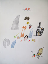
I find designing a logo very difficult. No matter how clearly I feel I know and understand a brand, I find it hard to sum up so much information in such a small symbol. I think you have to be very aware when designing a logo as every choice you make says something about your company, whether you like it or not.
With that said, I have been playing around with the brand identity for Specks & Keepings for a bit now. I think I prefer the logo with the two parallel gray rectangles and the little brown rectangle above. They remind me of a chimney collection, a person sitting at a table, and woven fabric. I've been thinking about the stitched cross on the Dutch Darning Sampler, small collections, soft goods, memorable symbols, whispered stories, special objects, the idea of home, and quiet moments.
I'd love to hear what you think as I've been working on this alone in a small dark room with very little input...and that usually doesn't make for the best work. Maybe one day I will be able to afford to hire a graphic designer. That would be wonderful.
i love how this is looking! i am excited to see the final result!!!!
ReplyDelete